How’s the headline?
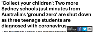
At 24 words in length, it feels convoluted and not SEO friendly. It fails to name the school involved, which users are likely to search for and instead gives unnecessary information best left for the standfirst or body.

How is the interface?
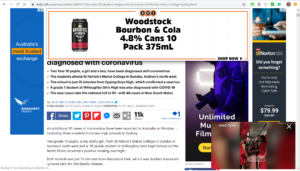
Overwhelming and distracting are the only ways to describe the flurry of advertising, videos and unrelated stories surrounding the main text of the story.
Before a user is first able to read the story, an auto-play video pop-up appears in the right-hand corner of the page.
Further, the page’s banner ad initially follows the reader scrolling, partially blocking text from the story, which is then consistently interjected by advertisements and links to other stories on the website.
Are there useful links for users?
No, the story does not provide any hypertextual links for context or further information on any topics/previous stories discussed in the article. The links to news stories around the text are also not related to the content of the article.
Users can click a link to the author’s other stories for the Daily Mail Australia and to follow her on Twitter. However, no bio or description of the said author exists in this link, and the Twitter page is set to private – small steps can lead to greater transparency and accountability.


Great analysis and well presented. In your post you use the techniques outlined by Bradshaw and in other readings (shorter paragraphs, subheadings, white space). When using subheadings, instead of using bold text, to enhance SEO choose heading tags (the dropdown option at the top left of the toolbox). You also caption and attribute your photographs (though the attribution link could be embedded in text rather than spelled out as a URL).
The link text in your final par could be embedded in a sentence that doesn’t explicitly say “link”, e.g. Users can find the author’s other stories for DMA …” Using “link” as a link text is a little like using “Click Here”.
You could use more of the terminology relating to the features and functions of online journalism, for example multimediality, chunking, etc.
If the banner ad and other intrusive advertising detract from the user experience, what suggestions could you make for minimising them, considering The DM’s revenue requirements?
There are actually links to the site’s top stories – they’re in a video slider just under the map (they’re not at all obvious, though!) There is also a link to a story in the bullet points under the headline – the final point is a link to a story named Coronavirus symptoms: what are they and should you see a doctor? – but the link text is in dark blue, which makes it difficult to see among the black text.