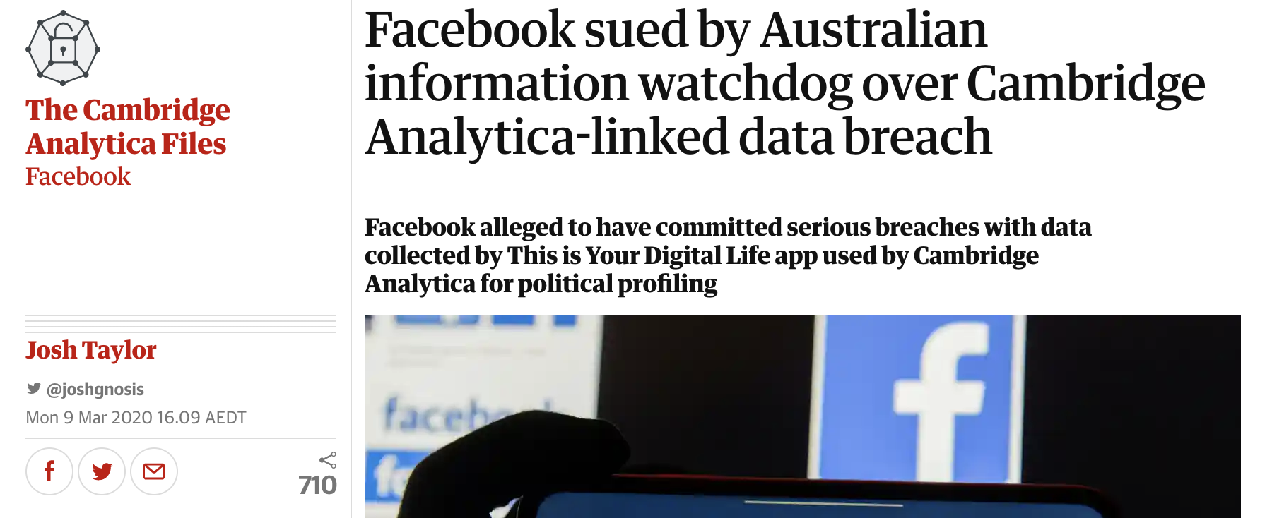
This post I will discuss the news from The Guardian, Click Here to read the original article.

Interactive: No interactive section provided
This article offers many social media platforms to encourage readers to share the news. But on the content page, there is no comment section where readers can write down their opinions and learn other’s standpoints.
Hypertextual: Inconvenient page jumps and Lack of effective link
This article has four in-text links with keywords “Cambridge Analytica” and “Facebook”.
However, the links fail to indicate the sending contents. Especially the first two links. “Cambridge Analytica Scandal” links to a relative article which talked about the infamous company and also provided background information on Australian privacy act. It makes the second link meaningless, which connects to the page of “Cambridge Analytica” with repeating show the same article. Besides, it is better to create a link on “This Is Your Digital Life” to explain the reason for this prosecution.
Additionally, the links are better to open a new page, rather than jump to other articles directly.
Multimedia: Lack of explanatory images
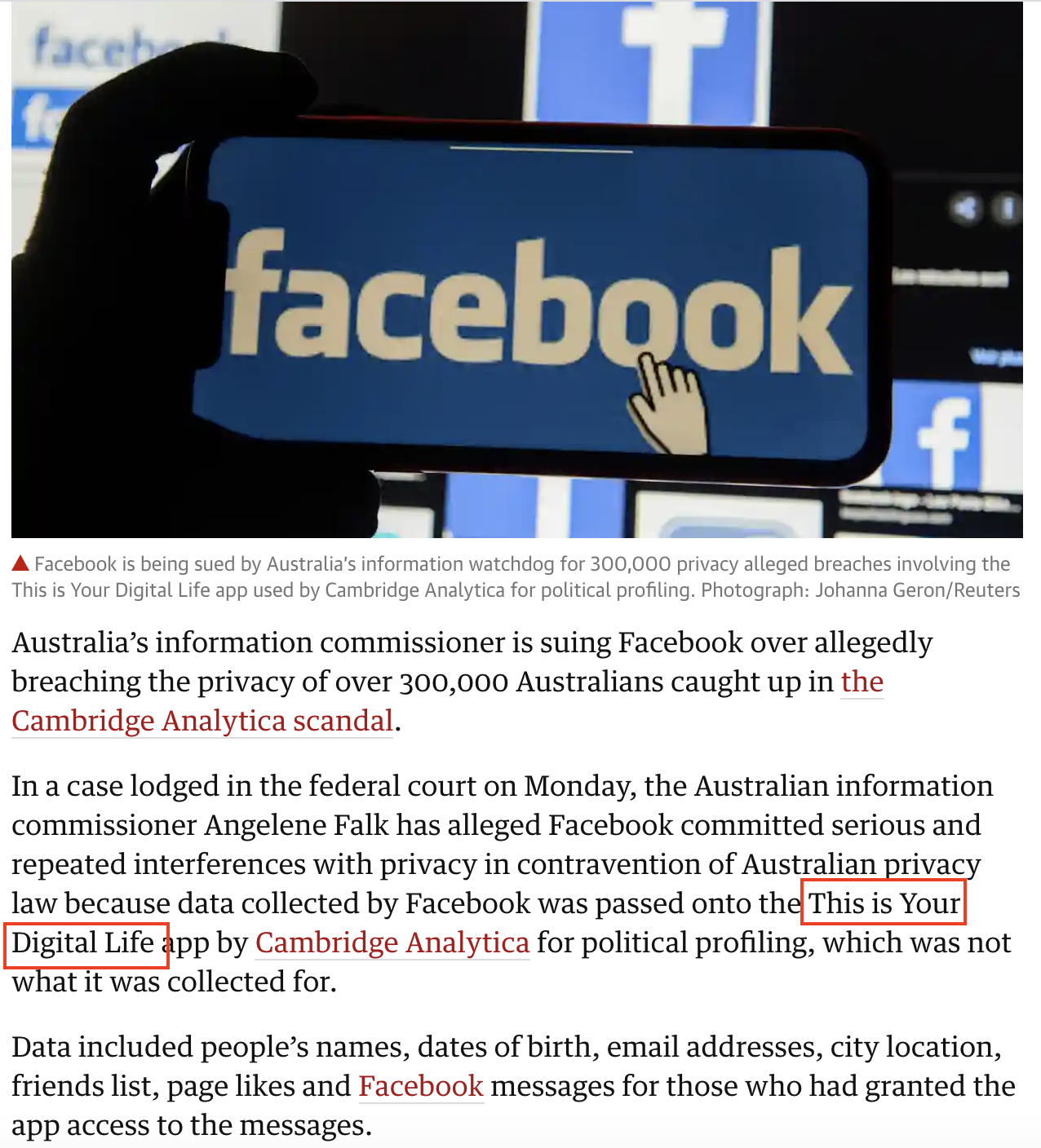
This 500 words news only has an image with the logo of Facebook, which shows less information about the content. It is better to use some explanatory photos relate to the content, such as the photo of “data breach”.
Also, when talks about the statement of OAIC, it could embed the Twitter post to convince the content.
The Australian Information Commissioner has lodged proceedings against Facebook in the Federal Court, alleging the social media platform has committed serious and/or repeated interferences with privacy in contravention of Australian privacy law: https://t.co/mN59oUzKgX pic.twitter.com/iP0rk8R7Vo
— OAIC (@OAICgov) March 9, 2020


Good use of featured image (allowing the thumbnail to appear on the home page).
Don’t use ‘click here’ as text for embedded links! You should have used ‘the original article’, or even better, ‘a news story from The Guardian’ because it signals where the reader will be taken, as well as attributing the site.
You mention that The Guardian’s links don’t open in new tabs but take readers away from the story page … your post link doesn’t open in a new tab either …
The second Cambridge Analytica link goes to a list of Guardian stories about CA, so I don’t agree that it’s meaningless. But they might have been linked in a clearer way, e.g. ‘more about Cambridge Analytica’ in a list of links outside the main story text.
How would you illustrate ‘data breach’ in a photograph, or use more ‘explanatory images’? Provide examples.
Good use of some of the relevant terms relating to the features of online journalism, and you have also used some of the techniques of good online writing (subheadings, an SEO friendly headline, key word tags). Could The Guardian have made the story more scannable and easier to read by using sub-heads and bullet points?