People Are Calling On The Government To Pay Casual Workers Who Miss Work Because Of Coronavirus
News Link: https://junkee.com/casual-workers-coronavirus-quarantine/245980
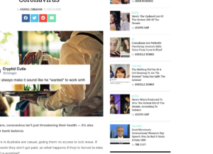
The first issue with the news story is the choice of feature picture. The Twitter screenshot with the background does not create a strong emotion. I will replace it with a picture like “union people having a meeting.” The structure of the news story is also not well organized and does not follow the “invert pyramid.” I will put the paragraph starts with “Unions are now calling…” to the first paragraph to tell readers “who, when, what, where” first, then start to tell the story of the man who worked at Hobart Hotel.
This news story includes a lot of Twitter screenshots to show how people react with the issue that casual workers forced to work during coronavirus period, but I will delete some of the 8 Twitter because there are too many. Those with very few likes and comments should not be included because they are not as credible and authoritative.
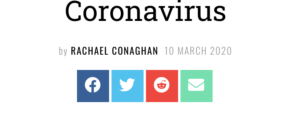
The other thing needs to be improved is the position of sharing. As figure 1 indicates, the sharing to other social media platforms is right below the headline. No one will share the news before they read the content. I will make it move when people scroll down, or at the bottom of the body.

The related news stories located at the right of the headline are not relevant at all. As figure 2 shows, only one of these six news stories is political, but still not about coronavirus. The rest of them are all about popular culture. I will link to news stories that are more relevant.


Is this a news story? It reads more like a curation of tweets, and takes some time to get to the actual news, which is that the ACTU is saying casual workers need protection – this you identify in your first paragraph.
In your blog post, your hyperlink should not be spelled out as a URL. It should be embedded in a phrase that tells the user where they are going. Hyperlinks should also open in a new tab.
A lot of news sites have ‘share’ buttons at the top of the story, assuming that people might share after reading just the headline and the first paragraph. It’s a good suggestion to also include them at the bottom.
The tweets included in the Junkee story are embeds, not screenshots – this is an important distinction. It also enables them to include video from another media organisation (@TheTodayShow). The credibility of a person tweeting does not rely solely upon the number of likes or replies their tweets have received – their identity and occupation would be the primary indication of authority.
Your post headline could be more SEO-friendly, perhaps making use of the relevant keyword tags you identified.
Good use of images to illustrate your points, however the captions could include the source of the image and a full description of what the image shows (e.g. “Screenshot: Links to entertainment stories in the sidebar”)
Is Junkee’s headline SEO friendly? Does the story contain SEO-friendly keyword tags?
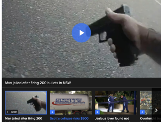
What do you think of the autoplay video on an unrelated topic at the bottom of the story?
More use of the appropriate naming conventions for the functions and features of the story are needed, along with a reference to a reading or readings.