

By Jon Hin Tan
This ABC news report on the latest World Happiness Report covers the decrease in ranking of Australia and what index the report use to measure happiness. There are couple of areas this article is lacking in, such as relevance of the feature image and data visualization.
Relevance of the feature image
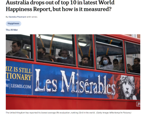
In the original article it feature an image that contains a very iconic London double decker bus that has Les Misérables advertise on it. The featured image is confusing, making it difficult for readers to establish a clear connection with the content. Especially on a news platform that is mostly faced toward Australian readers, the article fails to engage the audience effectively and does not create a compelling reading experience.

Updating the image to a more relevant and compelling one could enhance readability and create a more engaging experience.
Data Visualization
In an article that heavily relies on data progression to support its argument, merely listing the top ten countries from the latest World Happiness Report without including Australia’s ranking, despite mentioning it in the title, appears inadequate.
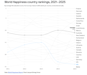
Adding an interactive data visualizer would have significantly enhanced the reader’s experience, making the article more engaging and accessible, and it would have provided more context, allowing readers to better understand and interpret the data in relation to the broader topic.
Be the first to comment