
There are a lot of areas worth improving in this HuffPost news.
First, in terms of the overall layout, the font of this news is small, and there is no obvious division of paragraphs, which is not easy for readers to read. I think it should enlarge the font of this news and divide it into sections. At the same time, add a subheading for each paragraph and display the subheading in bold font. This helps the reader to grasp the important information in each paragraph in a short time.
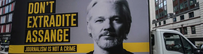
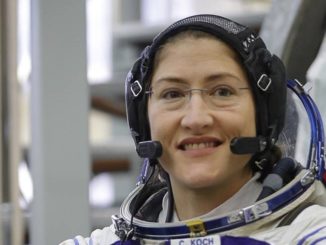
In addition, there are too many advertisements in this news. There are only two pictures related to the news content, but there are as many as eight advertisements. These ads are in a prominent position, which will fragment the article and may distract readers’ attention. In my opinion, relevant pictures can be added to enhance the visual effect and help readers understand. For example, maps of Yemen and the Red Sea can be added, showing areas controlled by the Houthis, the locations of U.S. air strikes, and relevant conflict hotspots to help readers more intuitively understand the geographical context.

Be the first to comment