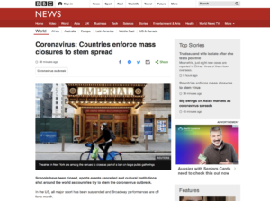
original news link:https://www.bbc.com/news/world-51862347
 I read the news from BBC new. Although the country or store closure is a news thread and news topic that people pay attention to, there are still some improvements in the content.
Content structure:
The structure of the article is chaotic, the information seems to be pieced together in a hard way, and the story has no coherence
First of all, in the middle of this article, the author inserts information about the shares prices continue to plunge. Although this information is also about the influence of corona virus, it is inserted suddenly in the middle of introducing the closure of various stores, which will make the readers feel confused. The way to improve would be to wait until the author has covered all the closed stores and then add the effect of the virus on the stock market, which seems logical.
In the middle of the article, there is also a column called More about Coronavirus, which explains how to keep safe. Although the intention of this column is good, it is not appropriate to insert it in the middle of the news. The author can put this column at the end of the news, which will also serve as a reminder to the public and a summary of the article.
Image and video:
This news contains two videos. First of all, I think it is unnecessary, because it takes up too much time of the readers. Besides, there is a long advertisement at the beginning of the video, which makes the readers feel inconvenient.
In the middle of the news, there is an image named ‘cases outside China continue to rise’, which position can be exchanged with the first photo, which can give the reader a simple background, and then start the description of the news.
Community:
This article can be Shared on social media such as facebook or twitter, which may seem human, but in my opinion it is mandatory to repost it to get attention. The BBC can set up a comment section at the bottom of each story to make it easier for readers to express their opinions.


Good use of shorter paragraphs and subheadings, which both make your blog post scannable and easier to read and understand.
The reference to the share market is one of the latest developments included in dot points under the first few paragraphs – most of those points are peripheral to the closure of shops and institutions, but could they be important in announcing breaking news and latest updates for users? I think so.
The “More about coronavirus” section is standard on all of the BBC stories about the virus – again, rather than being a distraction, I think it’s placed there to catch readers who have absorbed the summary of information in the first three paragraphs and subsequent dot points – it offers them somewhere else to go to read more (on the BBC’s website, of course!)
In your own blog post, the link to the story should be embedded in a phrase, not spelled out as a URL. I had to copy and paste the URL into a tab rather than following a link. When you link, ensure your links open in new tabs.
Your photo should have a caption, and it should credit the source of the image (even if the source of a screenshot seems obvious).
I think the featured photo at the top of the story has been changed since your screenshot – the one I see is different. Visit the link again – is there a reason you can think of that it might have been replaced or moved?
You make no mention of SEO or key words in your analysis. In the second part of this assignment, ensure you use the naming conventions for the features and functions of online journalism (hypertextuality, multimediality, chunking, etc.)