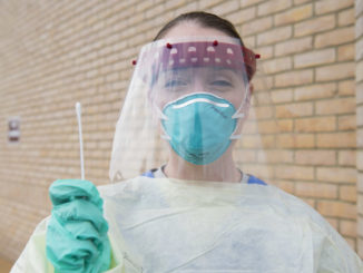
In this blog post I will be analysing the coverage done for the recent breaking news of Nadine Dorries testing positive for the COVID-19. My focus will be on the coverage done by The Sun; I have used BBC’s coverage on the same subject as a point of reference.
There are several adjustments that can be implemented to The Sun article. First of all, The Sun’s title is not SEO friendly but rather includes excessive information that should be removed. My suggested title is the one written for this blog post.
Other issues that the article includes are:
- The interface of sharing is misplaced; they should be at the end of article
- The piece is interrupted with too many repeated images
- Hyperlinks in the coverage takes you to another page which distracts you
- There is a non-responsive graph that seems to be a looping gif
- The piece ends with an update on the outbreak in Italy that could have been a separate piece
- There is also a comment section that is unnecessary as this news is fact based and not discussion based
Overall, I believe that the coverage should have been much more straight to the point and less cluttered.
References:
Burrows, T. (2020, March 11). Health minister Nadine Dorries tests positive for coronavirus after meeting Boris and Carrie in Downing Street. Retrieved from https://www.thesun.co.uk/news/11144782/health-minister-nadine-dorries-coronavirus/
Health minister tests positive for coronavirus. (2020). Retrieved 11 March 2020, from https://www.bbc.com/news/uk-51827356


Good suggestion for a more SEO-friendly headline, though it lacks the tabloid drama The Sun is renowned for! Their headline (“STRUCK DOWN”) might also induce concern or panic in readers, another good reason to be more straightforward.
Your keyword tags are good, but use separate words for ‘The Sun’ and ‘UK minister’.
You’ve also used bullet points well to summarise the main points of your critique and to chunk information – consider using a photo with a relevant caption and alt-tag for SEO – a screenshot in this case might illustrate points you make about the story being cluttered.
Your hyperlinks should indicate clearly where we’ll be taken to, e.g. “the coverage done by The Sun” – I would expect a link referring just to “The Sun” to take me to the home page of the publication. Ditto the BBC link – make your link text “the BBC’s coverage” not simply “BBC’s”
Not sure what you mean by suggesting the sharing buttons should be at the end of the article – a lot of news sites have them at the top of the story, assuming that people might share after reading just the headline and the first paragraph.
What do you think of the functionality of the social media images? Would you expect them to be embeds, rather than screenshots?
The looping gif worked well for me, and I found it the most engaging part of the story – a good way to illustrate the spread of the virus over a short time. I would be interested to know how well it worked on a mobile.
Great assertion about the irrelevance of comments on a fact-based story.