Introduction
In this article, I compare two news both covering the student strike for climate change, one from ABC News called Students defy warning from Premier Gladys Berejiklian and skip school to attend Sydney climate rally and the other from BuzzFeed called Australian School Students Have Gone On Strike For Climate Change.
Biography
Australian Broadcasting Corporation(ABC) is one of the major national public broadcasters. Founded in 1932, ABC has a history more than 87 years(ABC, c2019). In 1942, ABC acquired editorial independence through the Australian Broadcasting Act. In 1965, Bill Kennard designed the well-known wavelength logo which represents radio, television and online media nowadays.

In 1983, a new Australian Broadcasting Corporation Act set the framework and obligations for ABC, which is to entertain, educate and inform. In 2000s, ABC is shaped deeply by the digital technology.
The ABC Act set the tone of this corporation, a public broadcaster. It currently mainly relies on federal government funding, and a small part from commercial revenue. Early in 1970s, the Dix Review once suggested ABC to be more “entrepreneurially minded”(ABC, c2019). ABC’s unique obligation and framework will undoubtedly lead to a big difference in the content and style of its news compared with commercial news corporations.
Unlike ABC, BuzzFeed is totally a digital born media company. It was founded in 2006 by Jonah Peretti and John S. BuzzFeed started out as a lab to share the viral content online in New York City. Then BuzzFeed transformed itself from sharing contents into creating contents, which covers topics like animals, entertainment and food. In 2011, BuzzFeed began its News division in order to improve its hard news report and investigative journalism. Apart from the US version, it now also has different versions in other 10 countries, including the UK, Australia and Japan. In BuzzFeed’s profile page, it calls itself “world’s leading independent digital media company”(BuzzFeed, c2019).
As a digital media company, BuzzFeed is famous for its online quizzes, lists and videos. The format of content is quite different from legacy media. But with the establishing of BuzzFeed News division, BuzzFeed is getting closer to legacy competitors in providing serious news. In addition, BuzzFeed is commercial-oriented, which mainly relies on investment and advertisement revenue.
Demographics
As a public broadcaster, ABC develops various kinds of platforms including radio, television, websites, social media, apps and podcast to engage a broad range of audience. For example, the ABC has four television channels, ABC, ABC2, ABC3 and ABC News 24. ABC2 provides contents for younger adults between 7pm to 2am and for preschoolers (2–6 years) between 5am to 7pm(ABC, 2016). According to ABC’s annual report 2018, ABC’s net national audience reach is about 70.2%(ABC, 2018).
BuzzFeed claims that it has a global audience over 650 million(BuzzFeed, c2019). Because it’s main platform is digital media, BuzzFeed’s target audience are those who are active on the web or social media.The latest Verto analytics shows that BuzzFeed inclines to female readers(accounting for 70% of the total readers) and younger audience(43.7% of audience below ages of 34)(Hwong, 2018).
Journalism writing analysis
The ABC story is writing in a traditional way. In the lead, it shows the key elements of a news directly, including the who(NSW students), when(15 Mar), where(Sydney), what(skip class and attend a protest) and why(call for action on climate change). The author uses 15 quotes to support this story which makes it reliable. Those quotes come from different stakeholders, like government officer and student. But the problem is many quotes are saying one thing repeated. For example, the quote “But to suggest that they should strike during school hours is grossly irresponsible” and “But to take time off to go to a protest is not acceptable” are conveying the same information.
I don’t think it uses the inverted pyramid structure well. Personally, I will expand the five “W” in the following part. For example, I will explore further where those students come from, what their age range is, how long the rally lasts and what students do during the activity. Instead of answering those basic concerns, the author brings a discussion on if it’s right for students to skip class and attend a protest.
This story hasn’t been organized well logically. Followed by the lead, the author introduces that some celebrities are among the rally. Then she uses lots of word to describe the debates between Liberal party leader Gladys Berejiklian and opposite leader Michael Daley on if students should skip class to attend a protest. Finally, she turns to the rally in Newcastle without clear continuity logically.
The BuzzFeed news has a clear lead either, which introduces who(Australian school students), when(Friday), what(skip school), why(demand politicians take action on climate change). And then the structure of this article is breaking the rule in news writing. The author just organizes this story by putting some interesting points together, instead of using the common inverted pyramid structure. For example, they refer to a youngest protester Vincent, who is only 4 months old. They also find a 15-year-old girl Eleanor, who had attended the climate strike last year. My first impression of this article is fresh and a bit weird because the article is broken by many images and videos. The authors use much more Images and videos than words to tell the story. I think it’s a good try to set a scene for the strike through those visual materials. But in some cases, this news writing style makes the story look unordered and unfocused.
The BuzzFeed story uses 14 quotes from 7 different students who attend the climate strike. They express the true feeling of students and can have a strong emotion influence on the readers. But the type of interviewees seems too simple to cover the whole stakeholders. Another interesting thing is that the two author Hannah Ryan and Lane Sainty are more like citizen journalists who use their own twitters in the news story. And the video looks like just shooting by a mobile phone which tells audience that the authors were in that place at that time.
Online delivery and technical analysis
The ABC article uses 4 images and 1 video to strengthen the story telling. But as Fiona pointed out, this article hasn’t given a description for the embedded twitter video. So readers don’t know exactly the video author and the context of this video. As far as the images, some are good.

For example, the first photograph focuses on signs that students draw for protesting. Because the sign is red, it stands out from the busy background and can attract readers’ attention. The words in the sign are clear to see and the face expression of two girls in the foreground is excited which both help to enhance the topic.

The photograph of Mr. Morrison’s school report is also impressive. The photographer chooses a good frame about Morrison’s real doll and his school report, showing that the coalition government’s inaction on climate change. The four photographs all have detailed caption to show its content and author.
However, there are something we can improve in this article.

The author adds a same link to the words ”was expected to be one of the largest of the nationwide”, “climate rallies” and “today”, which is unnecessary. Also, the report’s link phrases are too long, which should be 2-3 words.

I think, the reporter should give the word ‘’ the Adani coal mine’’ a link to explain why students appealed to close this coal mine.

The tags used in this article are “environmental-impact”, “local-government”, “education” and so on. In my opinion, those tags are not optimal for search engine, because it’s less likely for users to search those key word in Google. Finally, there is no comment function in ABC news which obstructs the interactivity among readers.
The BuzzFeed story used much more visual materials, about 16 photographs and 2 videos. Those photographs cover long shot, medium shot and close-up which provide readers different perspectives of this event.
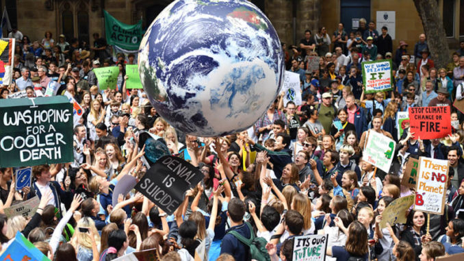
The first image is attractive with a big Earth model in the middle and lots of students around. This long shot gives a macroscopical view of this rally. It covers all the keywords of this story by image, “students”, “climate change” and “rally”. The embedded twitter videos have a clear description itself. And because the reporters share their own twitters on the article, it’s easier for readers to have a deep connect with them in Twitter. The BuzzFeed story does a great job in social media interactivity. Every image attaches a share function in Facebook and Pinterest. At the bottom of this article, there is a Facebook comment plugin which makes it easier for users to comment.
However, we can also notice there are many photos with wrong exposure.
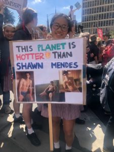

Some are overexposure in background, and some are underexposure in people’s faces. Most of those photos are only use a caption “BuzzFeed News”, lack of photo description and author information. It’s hard for the disable to use machine to read a multi-image news like that. And there is no link used in this article which may because this article has already embedded many photos and videos. Finally, this article lacks tags and it’s obvious not optimum for online search.
Conclusion
The ABC news tends to be conservative in news writing and delivery, but it avoids big mistakes at the same time. On the contrary, BuzzFeed news is braver in trying to break the traditional news writing structure and it often use more visual materials to tell the story. But, they both need to improve their links and tags.
(Word count: 1655)
References
ABC. (c2019). ABC History. Retrieved 29 March, 2019, from https://about.abc.net.au/abc-history/
Buzzfeed. (c2019). About BuzzFeed. Retrieved 29 March, 2019, from https://www.buzzfeed.com/about
ABC.(2016).ABC annual report 2016 [PDF file]. Retrieved from https://about.abc.net.au/wp-content/uploads/2016/11/ABCAnnualReport2016.pdf
ABC.(2018).ABC annual report 2018 [PDF file]. Retrieved from https://about.abc.net.au/wp-content/uploads/2018/10/AP18_Vol2_FINAL_3new.pdf
Buzzfeed. (c2019). Buzzfeed advertise. Retrieved 29 March, 2019, from https://advertise.buzzfeed.com/#contact-form?country=en-au
Hwong, C. (2018). Tracking the News: Reader Demographics. Retrieved 29 March, 2019, from https://www.vertoanalytics.com/chart-week-tracking-news-reader-demographics/
Briggs, M. (2016). Visual storytelling with photographs. In Journalism Next: a practical guide to digital reporting and publishing(3rd ed., pp. 153–184)
Bradshaw, P. (2018). Writing for the Web. In The Online Journalism Handbook: Skills to survive and thrive in the digital age(pp. 72–98)


Be the first to comment