I analyse a story about George Pell’s sentence for child sexual abuse published by BuzzFeed.
The news was written in short paragraphs with plenty of details, while the long plain text throughout the report is broken down with only one image and a tweet. It attempts to provide a thorough report toward George Pell’s case, but fail in the accessibility to outlook. It’s uneasy to pick up important information. Here are the points I suggest being improved:
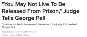
- Not necessary to repeat the heading and subheading

The lower line should be changed to describe the breaking news: Cardinal Pell was sentenced to six years’ jail for sexually abuse two 13-year-old boy this morning. The point is for those who didn’t catch up with George Pell’s news knowing what the headline is talking about.
- Use bullet point to conclude what the article mainly delivers in the beginning, like the report from Daily Mail did:

- Choose bold font for the lead for better readability
- Use subheadings to separate paragraphs into three part for a better visual engage: the sentence, the case and how the victim reacted to the sentence
- Use hyperlink to conclude some former reports: link the conviction in Dec 2018
![]()
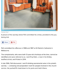
- Again, the image of the sacristy is good to be used ahead the case description, but I suppose to link the details with former reports to avoid too many text, which adds distraction to reading.


Good effort Leslie. Nice suggestions about the replication of the precede, the subheadings and the bullet points. The last point is a house style issue though, and you need to say why Buzzfeed readers would find that style of presentation useful. I agree that the sacristy image is useful, as it’s been the subject of so much debate but am not worried by the length of the caption.
In your next assignment don’t forget to set your links to open in new tabs, and include keyword tags. Also I’d recommend only 1-2 category tags. Your first link should have been: I’m analysing Buzzfeed news about George Pell to have an SEO friendly link phrase. Also this is a news feature, because it’s well over 500 words and after the first image the story goes into detail of the background to the case and the characters involved. For your assignment please check that you are analysing two news stories.