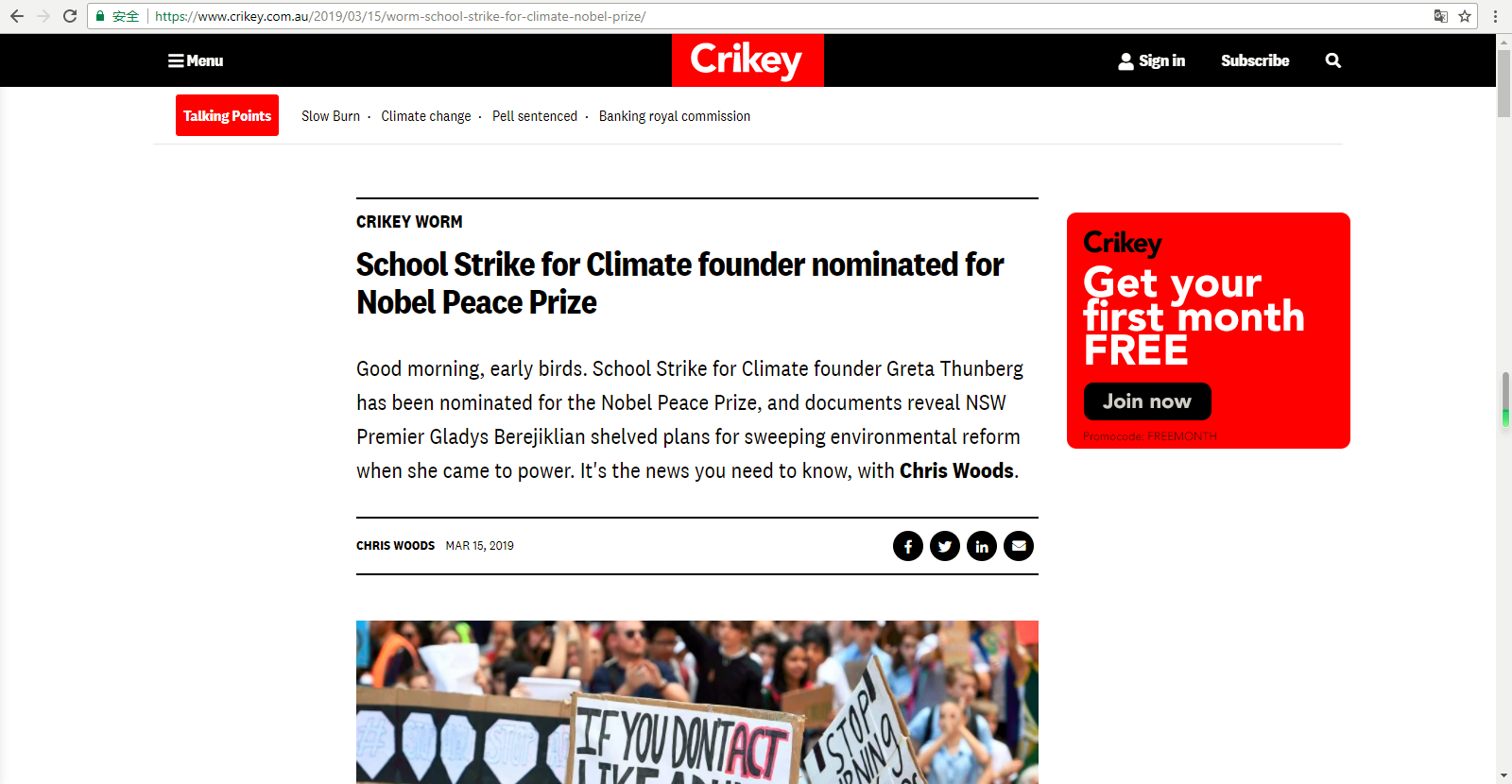
This story has a clear heading with relevant keywords. The text already is broken up by subheadings.
However, for better scannability, content should be more brevity. It is better to stick one sentence per paragraph.

Furthermore, the registration box should match the “F-shaped pattern” and place at the left edge of the page.

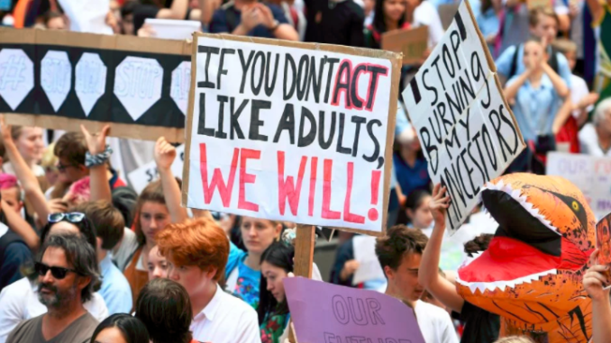
Multimedia in this story is weak. Images, audio and video could be added. These mediums can contribute storytelling, as well as breaking up the text.
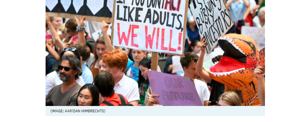
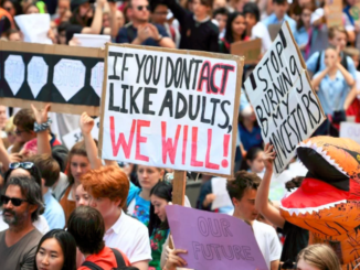
The caption of the image in this story does not describe the picture. Image caption should include keywords for better search engine optimization.
“Protests” is not the most appropriate word as a tag. Keywords (or tags) could be like “Greta Thunberg”, “Climate change” and “School Strike”.

Hyperlinks could be better if they were set up to open in new tabs.
Hypertexture in this story has linked to the background and relevant materials, yet they could be more succinct and unambiguous.

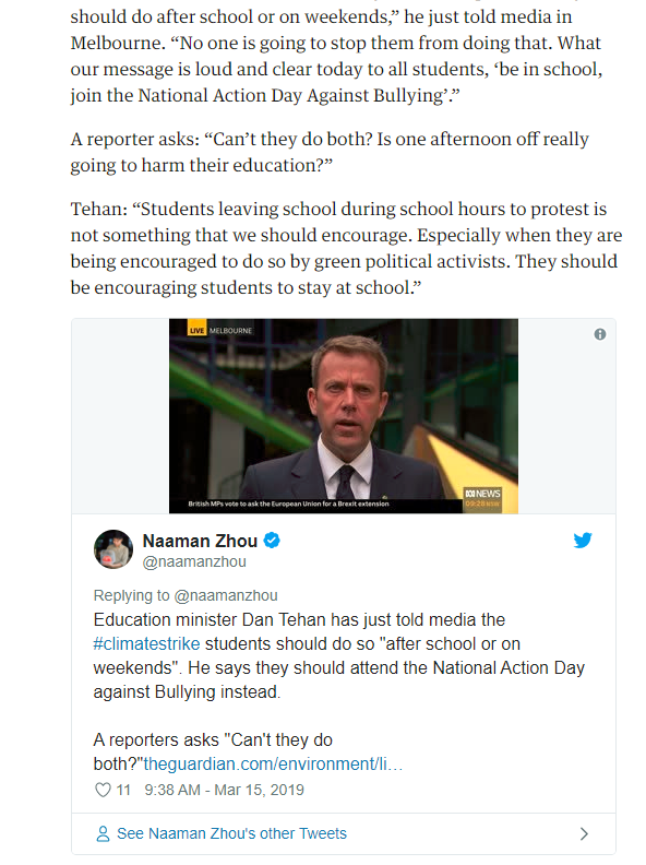
Also, when the story embedded link to Twitter, it’s better to make it looks like the example shown below.
Finally, the website could add “share” and “like” button to increase the interactivity.
(Word count: 200)


Great observations about the captions, tags, and links Kana. Also excellent use of the image link (although it’s not always easy to see that images are linked). I would have liked to see better use of keyword phrases in the links and also attribution of the Adani and School Strike material. What images audio and video could be added? Be explicit, and give examples. By the way this article does have share and like buttons on this story – across from the timestamp and byline.
Excellent web writing. Nice use of the excerpt ‘read more’ break tool too, but you could have added a link to the story and a brief overview of how you would have improved the story in that excerpt. Please upload an image of yourself to your blog bio to elicit trust from your readers