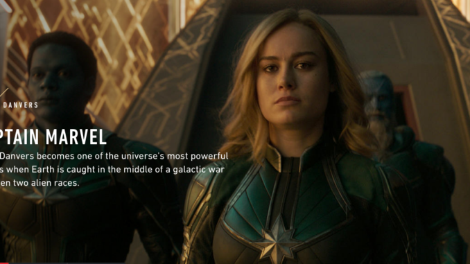
- Firstly, this feature about “Capital Marvel “from VICE which is talking about the latest MSU’s film”Captain Marvel“, the target audiences are definitely people who have huge interested in “Marvel”.The digital born service”VICE” always have excellent insights when talking about entertainment and culture, so this article is worth reading, great content is always the most important rule of all. But this article is too long for readers, subtitles should be added to help readers understanding the content better.
- Hyperlinks are useful and distinctive here.Extra contents are introduced to readers in an unique style with good title and fabulous images.But for such an abundant content, more hyperlinks should be used to explain the backstory and relative informations.

screenshot from’VICE” 3.In this website, audiences can see multimedia contents but images are not enough and should be more attractive, video is not available which is totally reduce user experience.
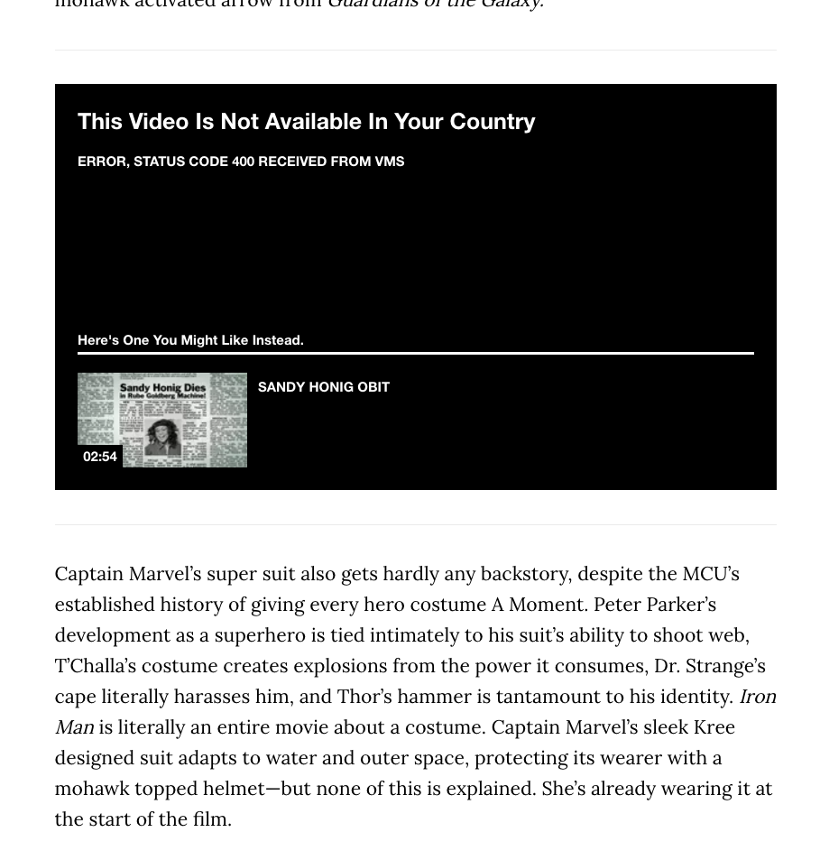
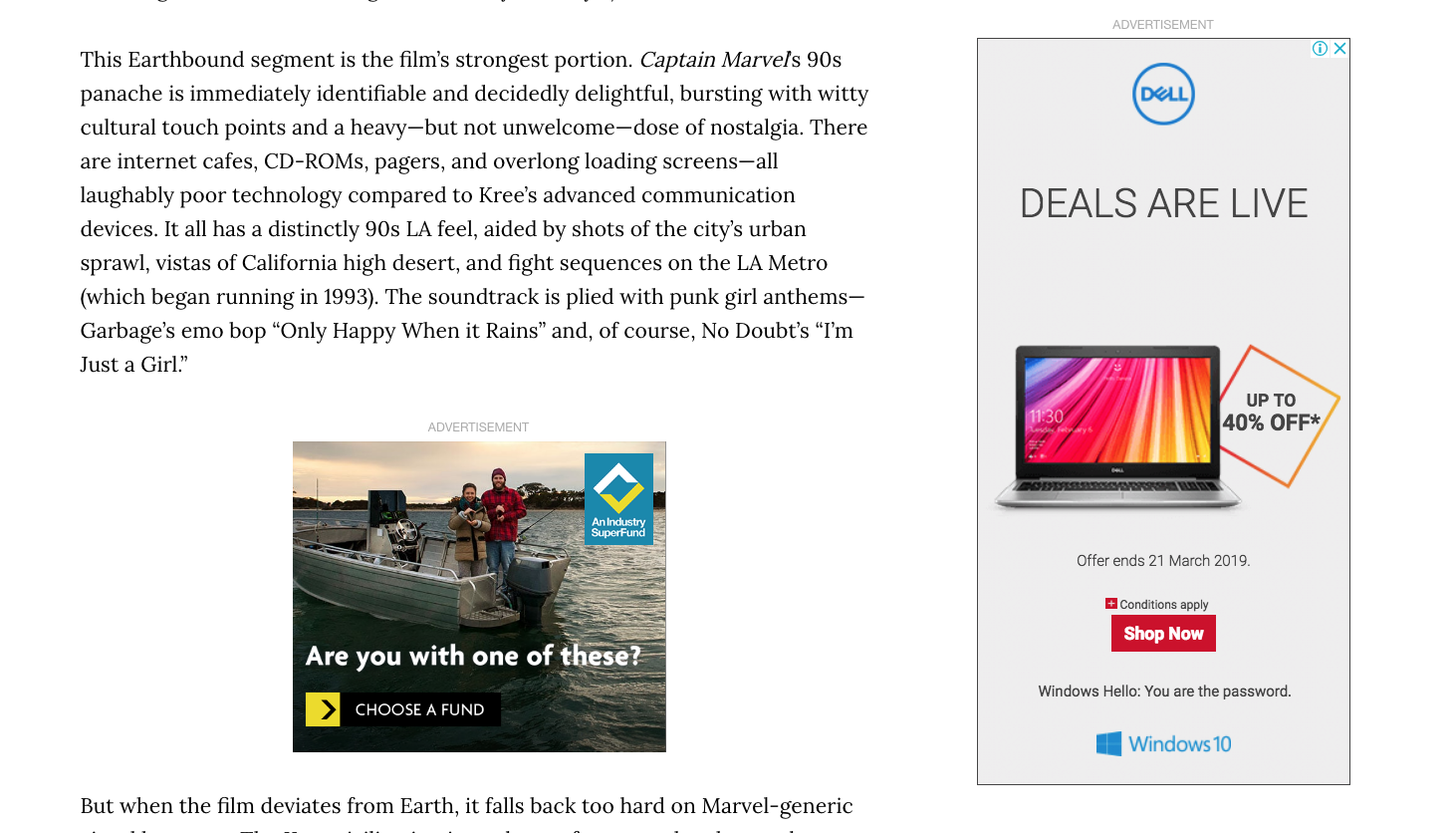
screenshot from “VICE” 4. Interface design is a bit of confusing with too many advertisements inside of article, move them aside should be better.
screenshot from “VICE” 5.Readers can follow the author to discover more informations about this article and interact with her. It is also easy for readers to share this article to their social medias including facebook and tweet.The share buttons are on both of the top and the end of this article which is convenient to readers. But there are still other social medias like instagram people always like publish their own ideas and emails to share with friends.
Tags are demonstrated and useful, but not enough, some highlights are not extracted well.
Followed additional content related to this article attract readers to stay for long time ,by using multimedia make the next step more enjoyable.
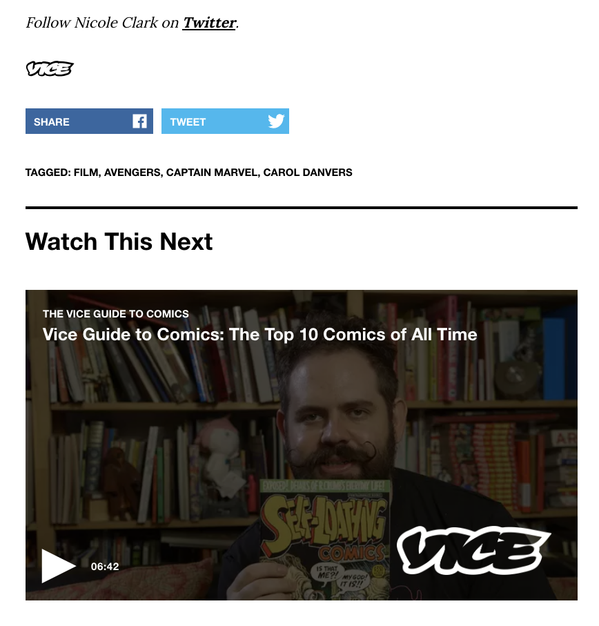
screenshot from “VICE”



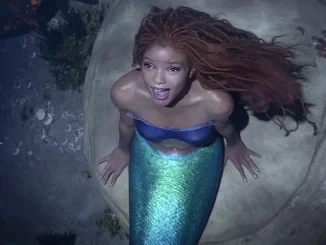
Interesting observations Grace. You have noted that this is a feature story (a film review), so for your assignment 1 you need to be analysing news stories of 500 words or less. I agree that subheadings were necessary to break up the text, and that the missing video was a user experience fail. What exactly would you have linked to and why? Give examples. I also think you need to be more realistic about ad placements. Ads are supposed to get in the way so we read, and maybe click on them. In terms of your web writing, you need to properly caption your feature image (who is the featured actor from Captain Marvel in the picture?). Second, your illustrations need to be larger as I can’t see the detail. Again, add captions to make it clear what I’m supposed to look at. Finally please check your spelling, grammar and punctuation before you post any assignment content.